
Turn your agency’s less successful landing pages into lead generation powerhouses.
Whatever the industry, the pressure to generate leads and make sales weighs heavily on most business owners. When you own or manage a marketing agency, that weight can feel even greater—after all, your own website and SEO should be conversion machines, right?
The truth is that creating a high-converting website takes time and, even if you’re a veteran of the industry, it’s not a given that your marketing agency site will perform like a champion from day one.
In fact, it’s fair to say that your website will probably always be a work in progress, because as a marketer you know that your job is never done and there is always another A/B test or conversion optimization tactic you can try.
Some landing pages just don’t convert as well as you thought they might. As a marketer, this is particularly galling as your own website should be the repository for your years of experience and have the benefit of all of the lessons you’ve learned over the years.
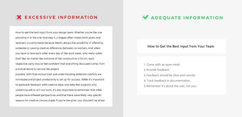
You may be tempted to log into your A/B testing tool of choice or grab your head content writer to overhaul the entire text, stat, but it’s often more valuable to rein in your instincts and, rather than dive straight in and start changing things, sit back and take time to analyze what’s actually going on with your landing page.
Whether it’s a local SEO service description or your social media marketing category page, you need to identify exactly why your page isn’t generating the leads and conversions you expect before you can start to take remedial action.
Bottom line? Don’t go on gut instinct. Employ the textbook marketing approach you present to clients. Most of the time, it will come back to a single root cause; that you need to do a bit more with what you have.
If this struggle is all too real, here’s how you can turn your marketing agency’s non-converting landing pages into lead generation powerhouses….
First things first: where are your potential leads arriving from?
The majority of the traffic hitting your agency website should be considered a potential lead. But, if your page(s) isn’t converting, you’re going to have to go right back to the beginning of your visitors’ and would-be clients’ journeys and find out where they’re coming from.
As a marketing agency, your lead generation tactics may well be numerous, from offline events such as trade shows and networking meetings to SEO, content marketing, ads and social media. One absolute no-brainer is listing your business on an agency directory focused on your area. You’ll be up against competitors but the added visibility gives you a better chance of bringing in leads.
In many ways, this diversity of traffic acquisition makes the first stage of landing page improvement that much more difficult. The key here is to decide where the majority of the traffic to your page is arriving from. Once you know that, you should be able to look at the page and ask yourself if the content and imagery answers the question or describes a solution in the manner that that visitor may expect.
Let’s say you’re looking at a landing page for local SEO services that simply isn’t generating leads or conversions. A quick look at your site analytics shows that traffic to the page comes from your LinkedIn page. Now, you have valuable information. You can compare the landing page with the LinkedIn post and ask if the page really lives up to the promise hinted at in your social postings.
Even if you’re saying the right things, are you presenting them in the right way?
If you’ve looked at your landing page and decided that the content is fit for purpose, it’s now time to ask yourself if your key messages are being conveyed in the right way.
Is the page visually appealing, first of all? As a marketer, you should know that, especially in today’s mobile-first world, images and videos are preferable to large chunks of text.
Even if your analytics research shows that much of your traffic comes from desktop visitors, your page should still be visually engaging. That means using images and videos where possible to grab the attention of your visitor and make it easy for them to absorb key messages.
Part and parcel of this process requires taking a critical eye to your page design. Are your fonts the right size and suitable for most screen sizes? Are you using colours that demand attention and complement each other? Is your page too busy with too many images, non-complimentary color palettes, too much bold and too many headers all competing for attention?
Using a heatmap report from a tool like Hotjar can be useful when you’re sizing up potential changes, as it tells you where visitors are drawn to and what they are skipping over. You can use this to hone in on where improvements need to be made.
Is your design user-friendly?
Source: Growth-driven Design
User experience testing is likely something you’ll preach to clients often—but have you ever put that know-how to work on your own site?
While your agency site may have been carefully put together when it was first created, emerging technologies and changes to consumer behaviors can quickly make some on-page elements less user friendly-than you’d like—which can have a big impact on your lead generation efforts.
If you launched your agency site more than two years ago, for example, you may not have designed navigation structures, menus and forms for a primarily mobile audience. That could make the contact form difficult to fill in when accessed from a smartphone, or the site difficult to navigate.
Large chunks of text with few headers and images are common on pages designed for desktop audiences, but these can be problematic on mobile and make it difficult for prospects to engage with your key messages. All of this means you’re serving up a frustrating experience to the visitor, making it less likely they’ll convert into a hot lead and trust you to run their marketing.
Danielle Irigoyen from Growth-Driven Design says that the top seven most common usability errors committed on business websites are:
- Small clickable regions
- Complicated navigation
- Too much information
- Poor fonts
- Lengthy contact forms
- Little search functionality
- Non-responsive pages
Is the value that your agency delivers clear?
Prospects will engage with your agency because you can solve a problem they’re experiencing or bring expertise and resources they lack internally to the table. If your landing page isn’t making your value clear, your lead pipeline is probably fairly short.
The key here is to look at your landing page with a visitor’s eyes. Is your value clear? Have you spelled out the problem and the solution? And, most importantly, have you done that right away at the top of the page?
If, for example, you’ve directed your LinkedIn traffic to a landing page created for your LinkedIn eBook in order to sell your social media management services, your value proposition might be that you can help clients make more sales, network more effectively, increase their revenue or get to grips with LinkedIn advertising.
That benefit, and the accompanying problem it solves (such as too few sales from LinkedIn, not enough connections, money being wasted on under-performing ads) should be clearly communicated. It’s not enough to say that you’ll transform their LinkedIn marketing, your landing page should be specific about how you’ll go about doing that.
You can use a number of features to ensure your value is clear, such as images, videos, client testimonials and pop ups.
What’s your call to action?
It’s tempting to use a standard ‘buy now’ or ‘download here’ as your call to action (CTA), but switching up the language used can inject new life into a stalled lead generation campaign.
Effective CTAs make the action required clear but also serve to act as the final encouragement for the visitor. Experiment with different CTAs on buttons and throughout the landing page—you could test alternatives to buy now such as ‘start your trial’ for example.
Try to use just one CTA button on your landing page, presenting a clear proposition and little to no distractions. You know where you want your potential clients to click, so why give them other things to click instead?
Finally, it’s important to get your CTA above the fold if at all possible, which can be tricky if it needs to appear beneath a contact form, but it’s worth the reshuffle. In fact, it’s a worthwhile goal to get all landing page content elements to fit into the space above the fold. This will help you to avoid cluttering the page with too much information and provide stronger focus points for the visitor.
Provide an alternative offers in an outro pop-up
Not all prospects arriving on your landing page will be convinced by the offer you present, even if they did click on that LinkedIn post to get a LinkedIn eBook. Here, you can add a little creativity into your landing page design and give yourself additional chances to convert that visitor into a lead by providing alternative offers or resources.
Rather than have that visitor leave without downloading the eBook or filling in a form, present them with an alternative suggestion which may be more appealing. To avoid doubling up on CTA’s, you should include this offer as an outro pop-up that triggers when a visitor attempts to navigate away from the page.
Drive traffic through multiple channels
Just because you have already posted that LinkedIn post today, doesn’t mean you shouldn’t repeat it next week. Similarly, it also doesn’t prohibit you from using that same post on Facebook or repurposing it for an email shot.
Similarly, listing your business on an agency directory is a great way of driving traffic and leads from places that people looking for your services are already browsing.
The more often you can get your message in front of the right people, the more likely it is that some of your traffic will become leads.
Use retargeting
According to ReTargeter,
For most websites, only 2% of web traffic converts on the first visit. Retargeting is a tool designed to help companies reach the 98% of users who don’t convert right away.”
If your marketing agency handles any online advertising for clients, you’ll already be familiar with retargeting. If not, it requires a pixel (a small piece of code) to be placed on your site which creates an anonymous cookie for new visitors. When those visitors go elsewhere on the web, an ad can be triggered to recapture that person’s interest.
You can use this to draw prospective clients back to your landing page, helping to generate more leads for your marketing agency.
How Can BrightLocal Help Me Generate Leads for My Marketing Agency?
BrightLocal offers a completely unique and highly sophisticated way to generate leads from your agency website without you having to lift a finger.
Our ‘Lead Generation Widget’ allows your website visitors to request an automated Local Search Audit via data capture, after which you can follow up with the potential client, audit in hand, to offer your services.
In the back end, you can fully manage the leads generated through this tool, building a process pipeline that delivers results immediately. Learn more about BrightLocal’s Lead Generation Widget.